Creating an app from the ground up
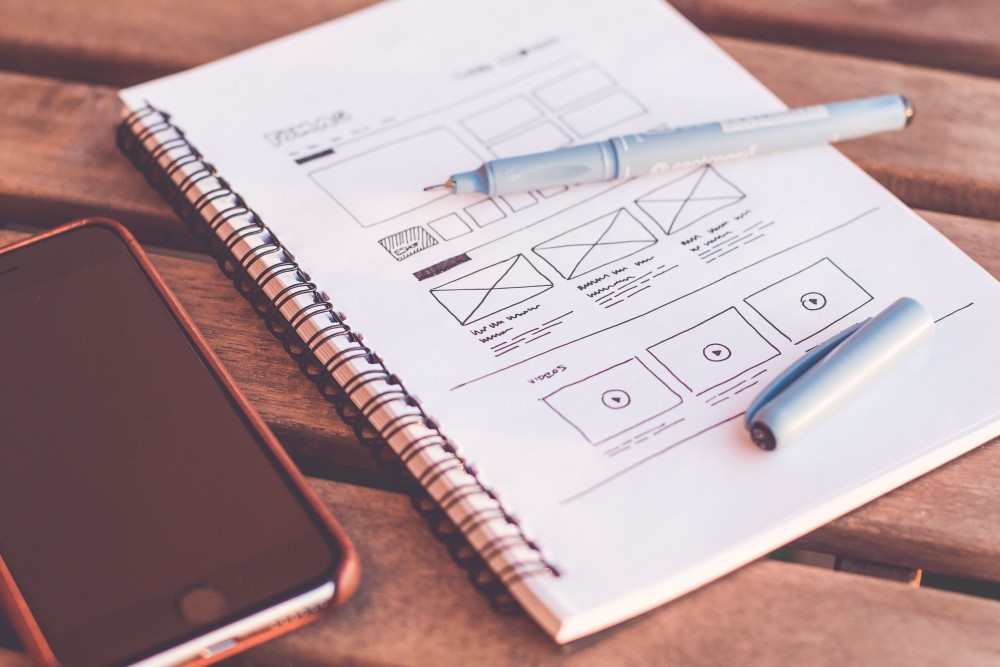
Is there a market need that can be filled? That is the first question that needs to be asked when creating an app. Once we have analyzed the need that we want to resolve, we have to ensure that all the requirements are covered with the features and functionalities offered by the mobile application.
This article covers the steps in the app creation process, from detecting a need or challenge through to the final design.
Problem posed:
When a vehicle is parked on the street, you never know who the owner is or how to contact them to report an incident, such as leaving the lights on, not locking the car, getting hit, etc. How can you notify a user if their vehicle has suffered an incident?
The challenge of this project is based on finding options for notifying the user of any incident that their vehicle has suffered. For example, if a parked car gets hit, most people opt for the most traditional method: leaving a piece of paper under the damaged vehicle’s windshield wiper with the details of the driver who hit your car. This option, at the height of the current technology era, is absolutely not the best choice, because the paper can get ripped, lost, wet, etc.
This case study has applied the Design Thinking methodology, which makes it possible to generate projects in an orderly and precise way, going through the different stages and obtaining an end product with a high-fidelity design. All of this is achieved with a creative team that is constantly innovating and highly motivated.
Design Thinking
This focuses on understanding and resolving real user needs. The methodology consists of the following stages: Empathize, Define, Ideate, Prototype and Test.

Empathize
An exhaustive study was conducted on the needs of the users involved in the solution to be developed and their environment.
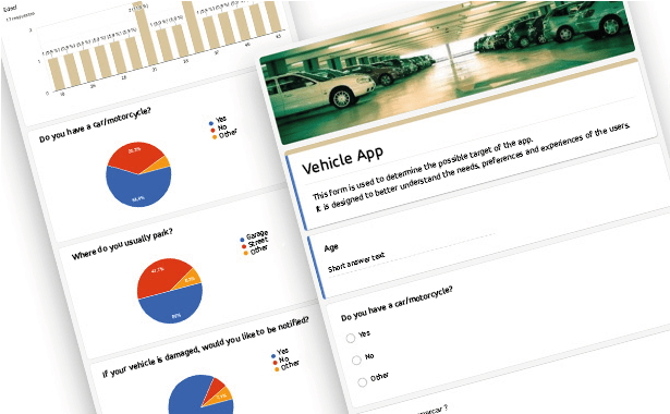
We chose to create forms that were distributed to different profiles to obtain relevant data and evaluate the different needs. The forms were created using Google Forms, as it is a simple and efficient tool for collecting data.
With the results obtained, we concluded that the target age range for the app would be individuals over the age of 18, as that is the legal driving age. With regard to reporting incidents, most users agreed that they would like to notify or be notified if their vehicle is damaged.
With these data and an initial market study, we confirmed the viability of the app in commercial terms.
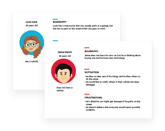
Based on the data obtained, we created two standard users through the user-person technique, which served as a guide throughout the design process, helping to focus the product.
Define
During this stage, we examined and selected all the information received during the previous phase to identify the key problems to be resolved to obtain an innovative result, filtering what truly adds value and, as a result, arriving at interesting new perspectives.
We defined:
- Content structure and organization.
- Proper access to the information taking into consideration the different user profiles.
- Creating of a clear and simple navigation flow that provides quick access to the most relevant information.
- Definition of application usage scenarios, as well as the key actions to be taken by the user. This will be used as a guide in undertaking the development of the information architecture and defining the different functionalities.
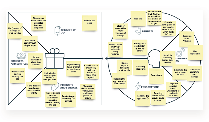
To generate value through the proposed tool, a value proposal was conducted in the Canvas model.
Ideate
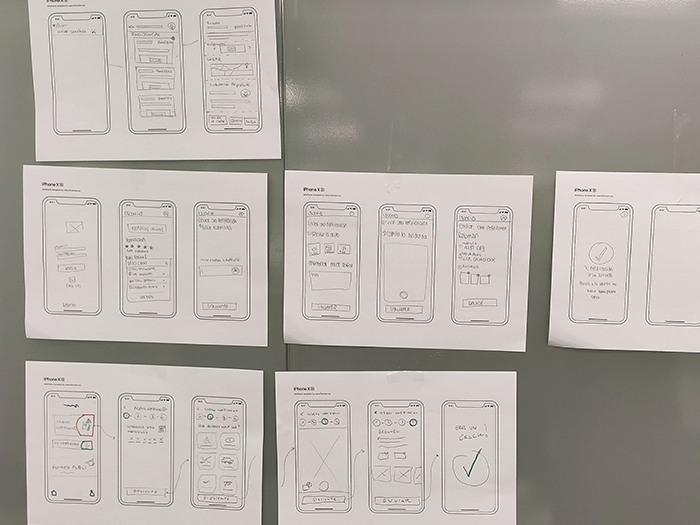
The goal of this stage was to create a convenient and intuitive navigation flow that avoids user frustration when reporting an incident.
To do that, the UX/UI team conducted a brainstorming session in which each member came up with a proposal that was then presented to the rest of the team. This process led to the definition of a navigation flow that would best fit the needs of the user.
Prototype
The prototype stage included designing the application in two phases: medium and high fidelity.
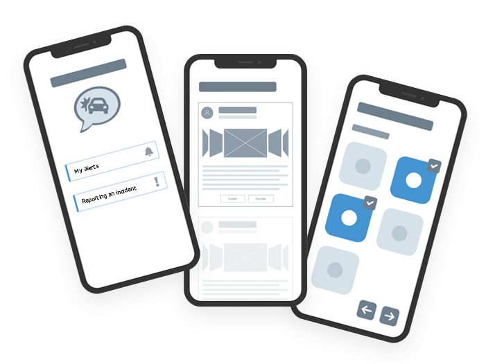
- Medium fidelity
Having designed the navigation, the process continued with the creation of the tool structure
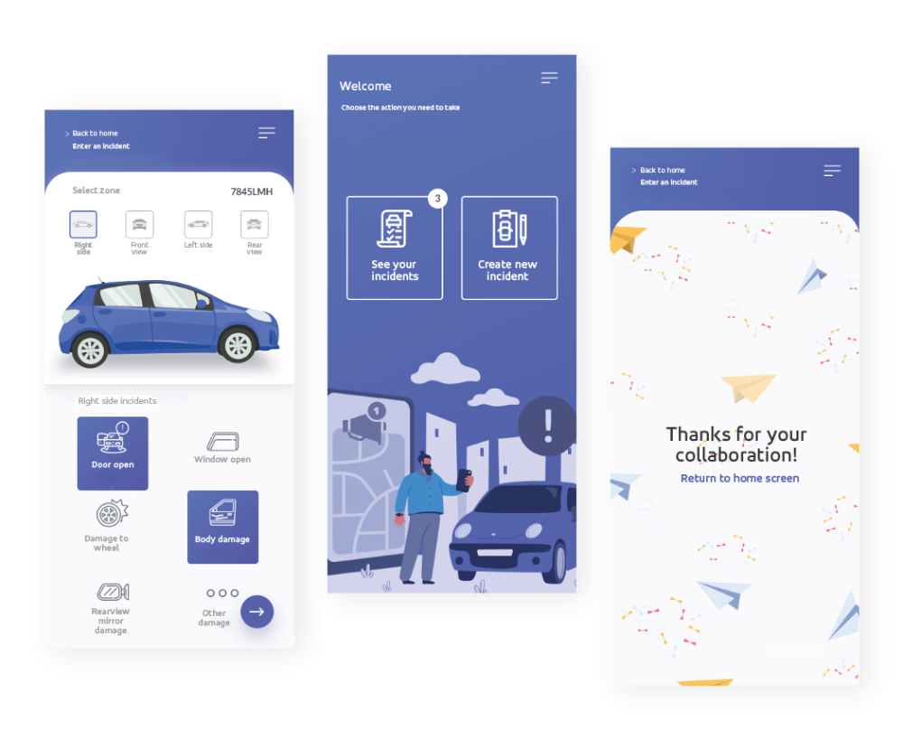
- High fidelity
In this final prototype stage, the high-fidelity designs were generated, applying the chosen look and feel.
Test
To ensure that there were no deviations throughout the process based on the users’ needs, we decided to test the final prototype. To do that, the product was shown to a limited number of users who were asked to use the tool and give their feedback on it. This provided important information on the status of the tool with regard to the navigation flow. We also observed whether there was any user frustration, or whether there were any opportunities for improvement.
Here is a demo video of the final phase of development of the app in Spanish.
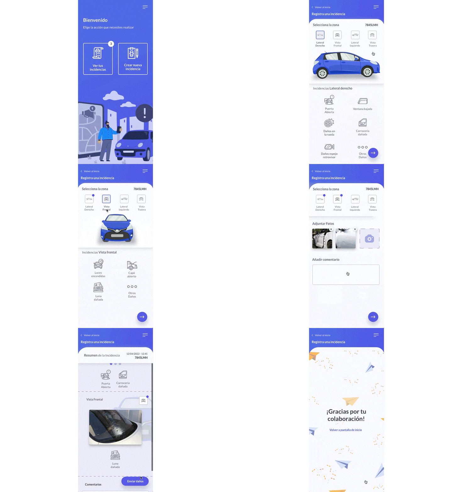
After testing the tool with different users, improvements were made to facilitate navigation, as during the testing phase some users had trouble completing the process.
That is how a mobile app was conceived from the ground up using the Design Thinking methodology. Using it makes it possible to maintain a product that is constantly evolving throughout the entire process, offering a product of the highest quality at the end.
More information at: https://www.gmv.com/en-es/uxui-front-end
UX/UI Team